Gallery Bogart

Framing the Frame: The Radical Minimalism of Gallery Bogart

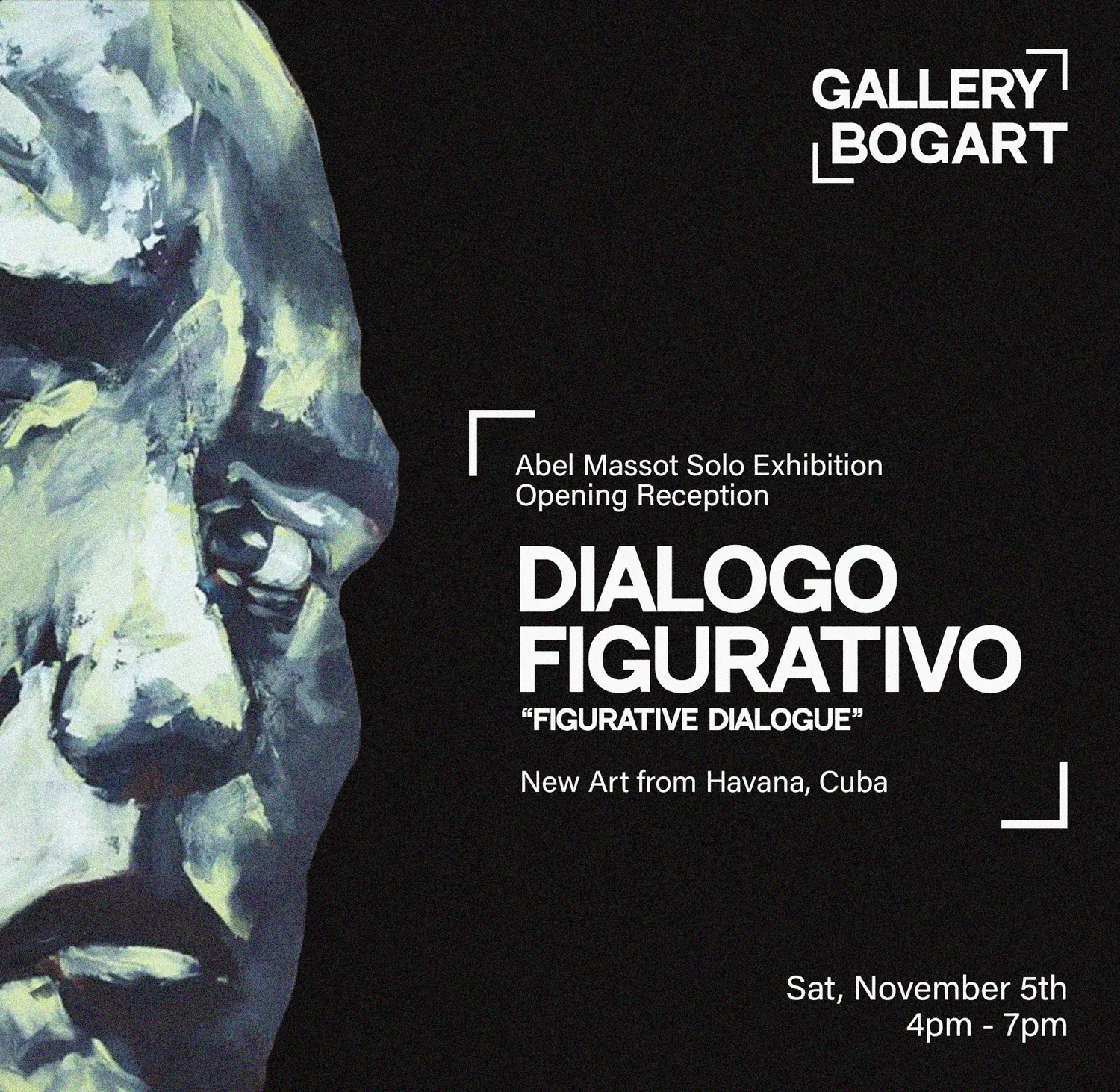
In a market that often wants Latin art to look “Latin,” Gallery Bogart chose the opposite: a brand that refuses costume. Black and white. Type over tropes. We designed a system that steps back so Latin American art can step forward.
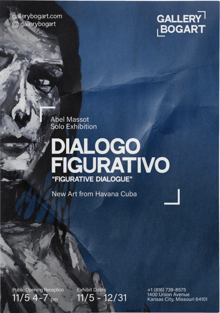
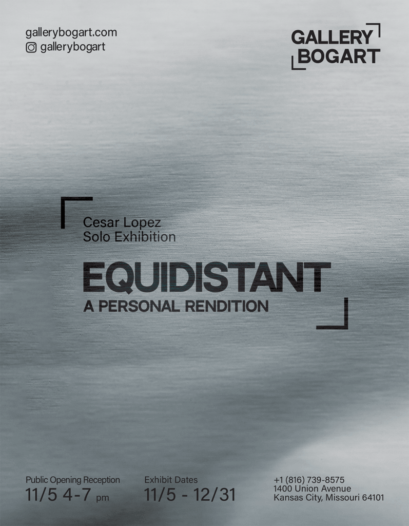
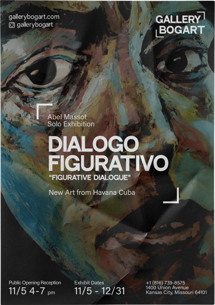
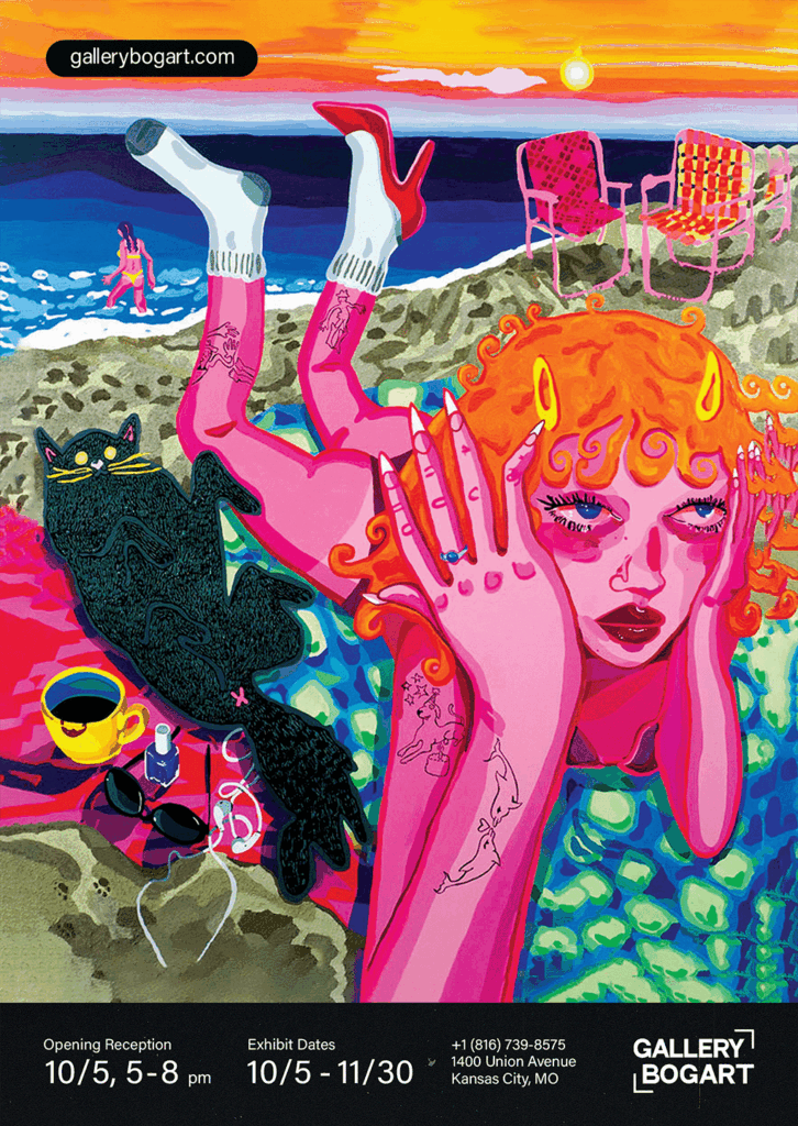
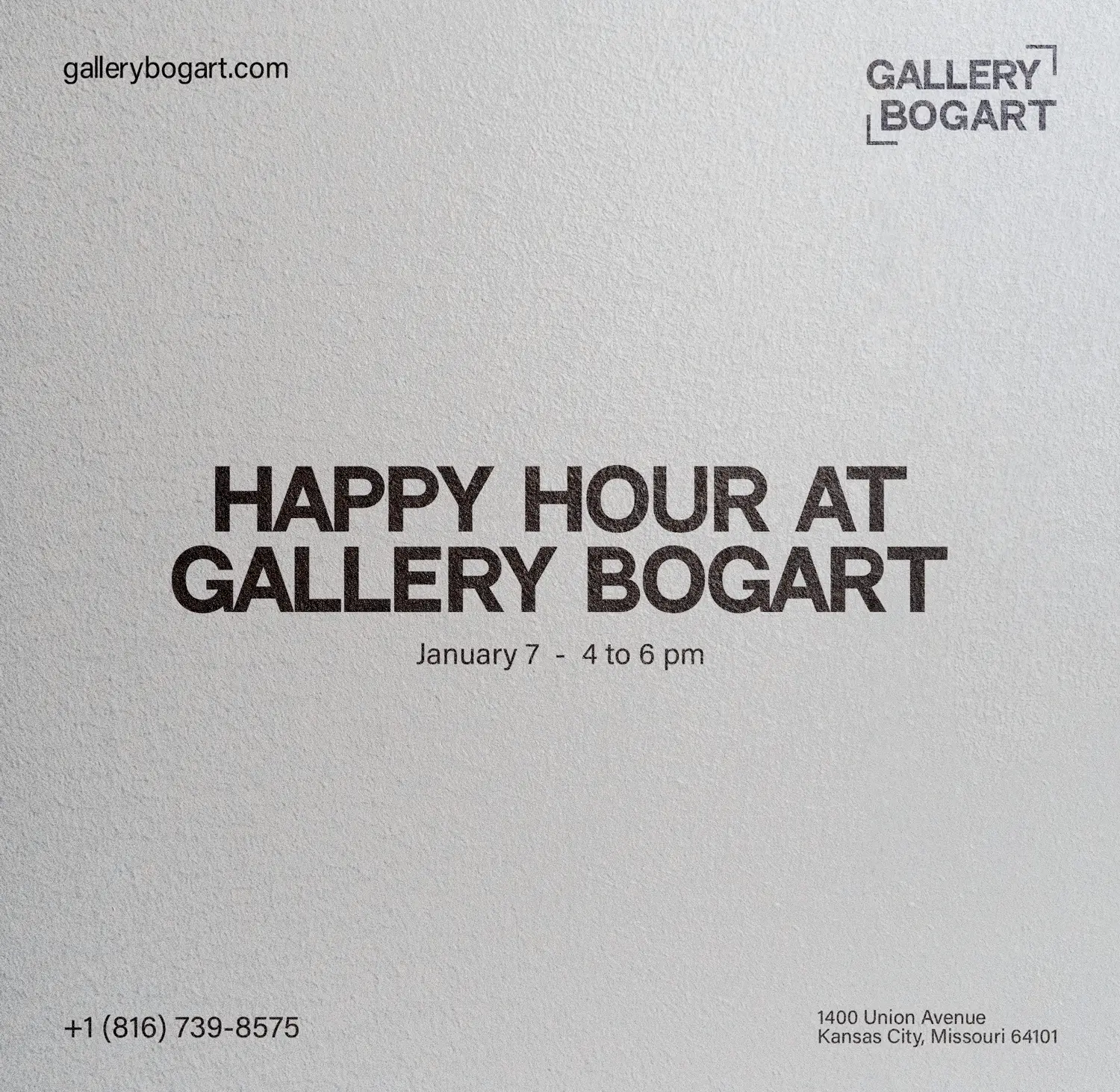
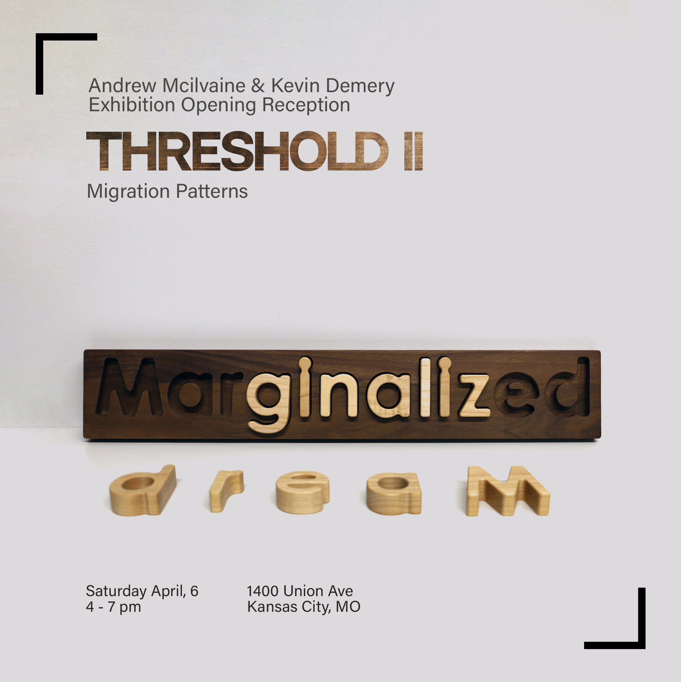
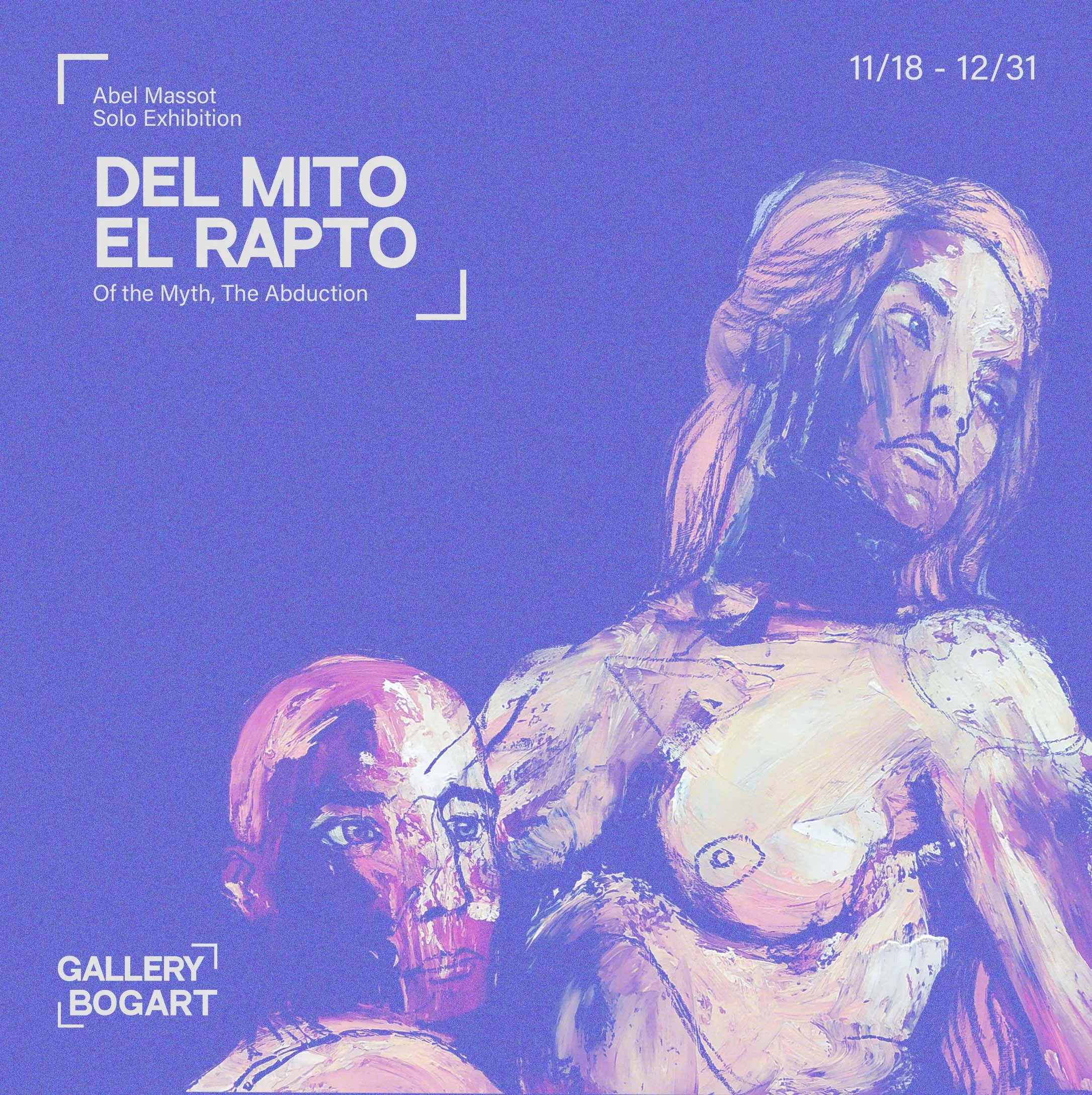
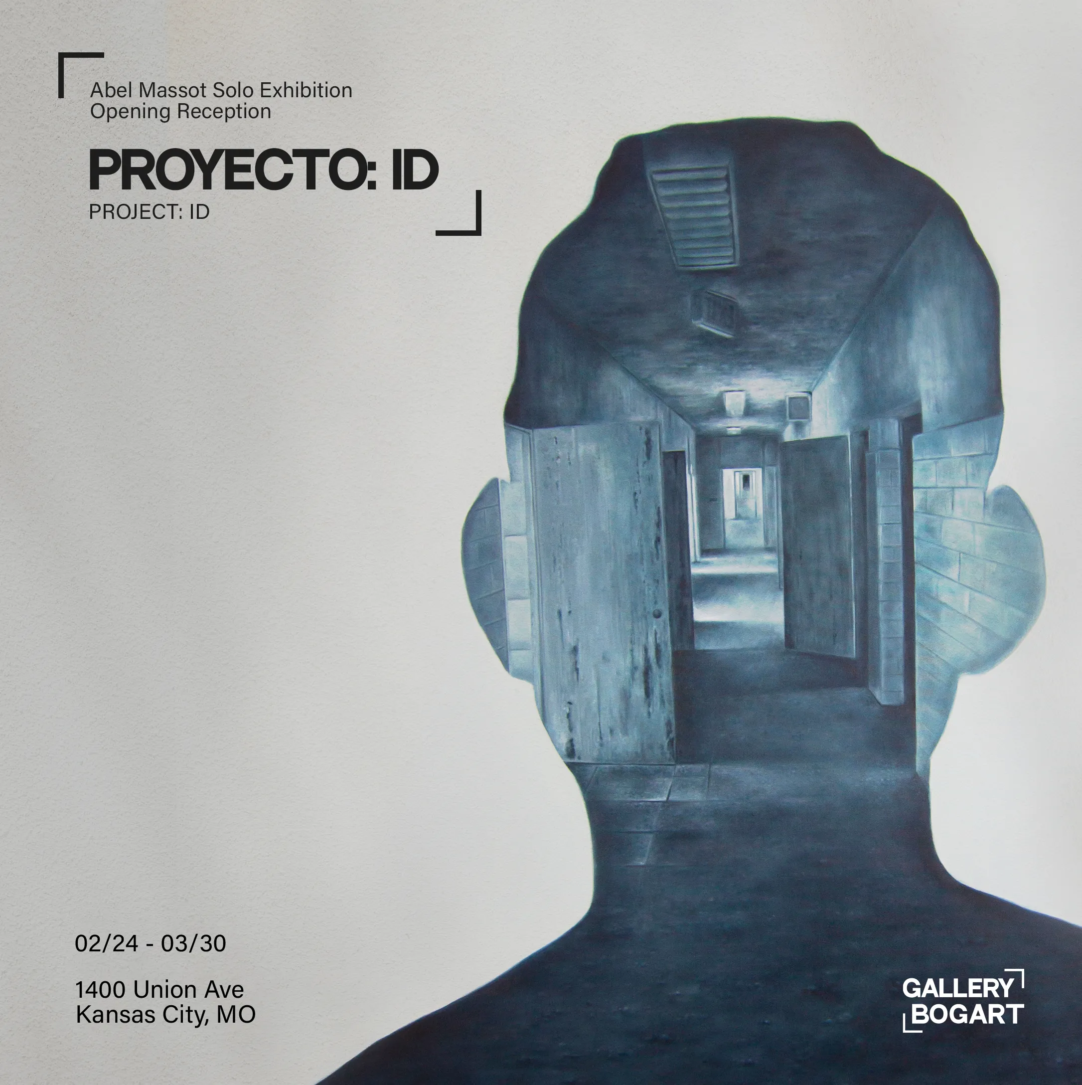
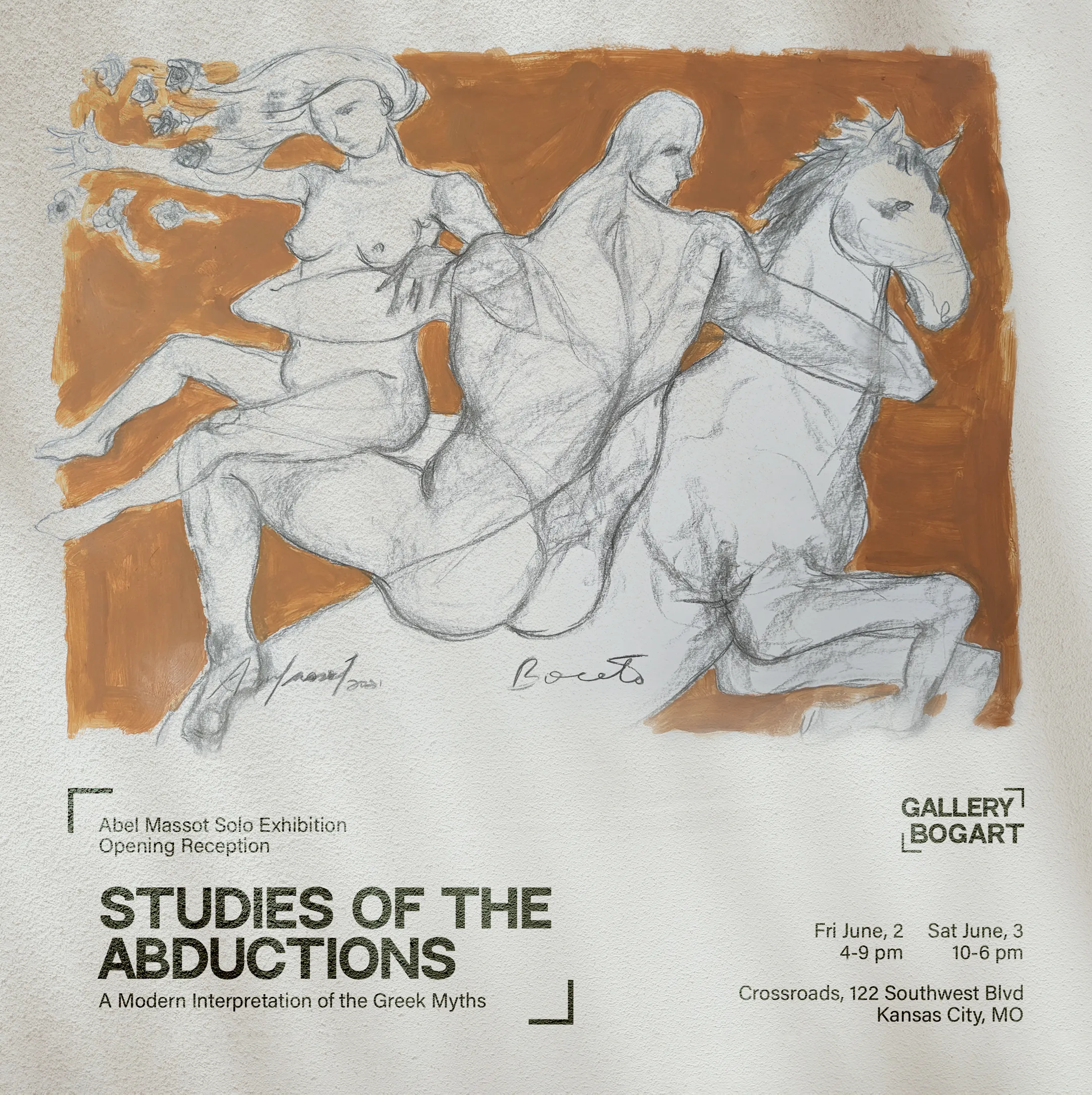
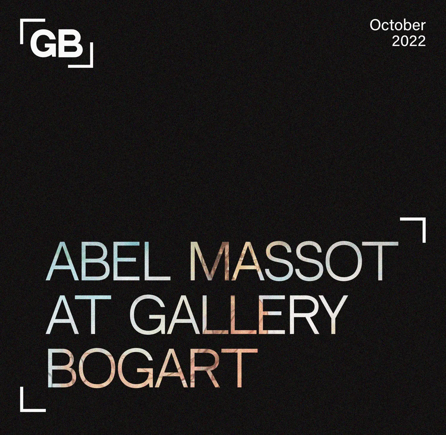
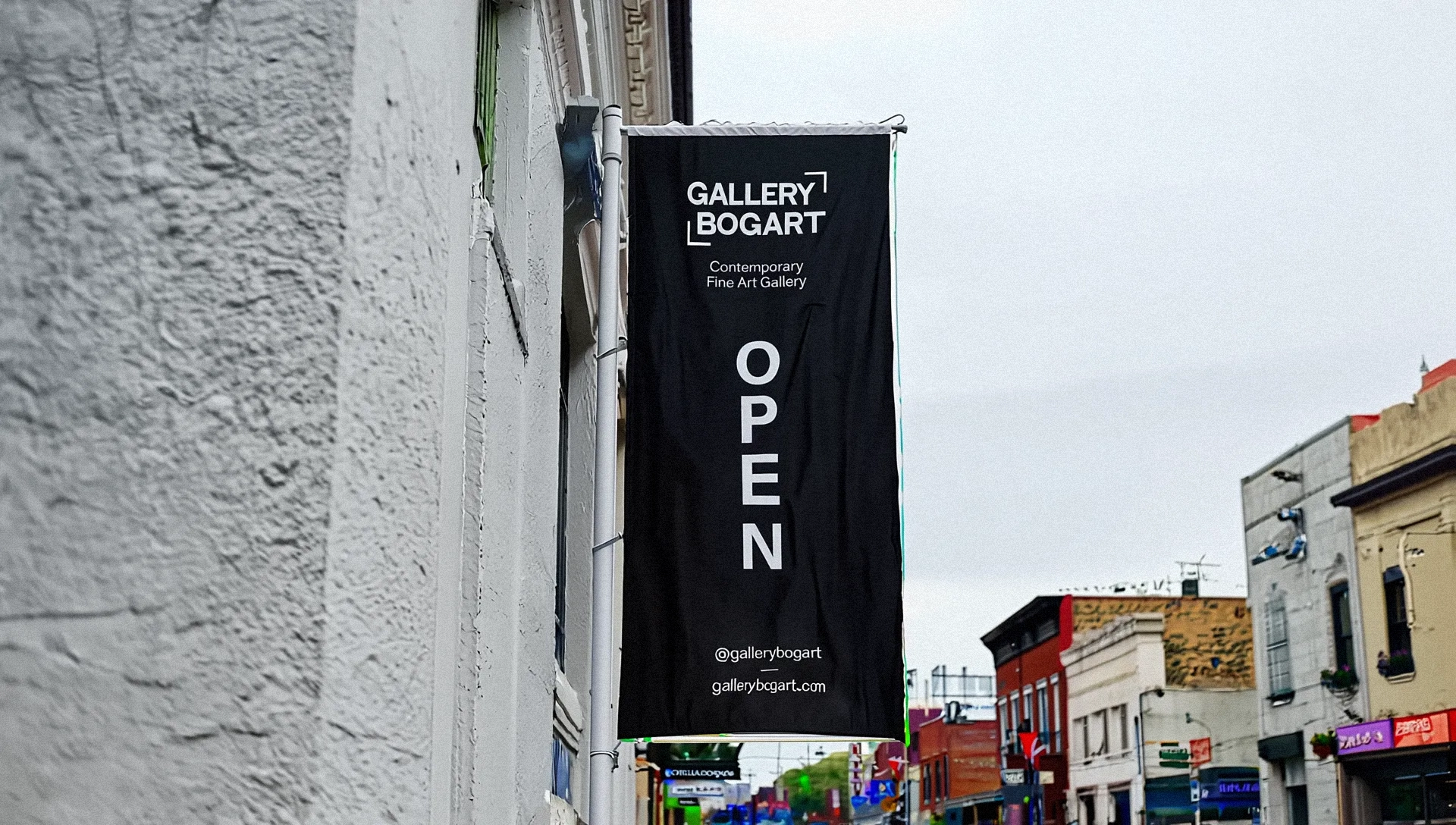
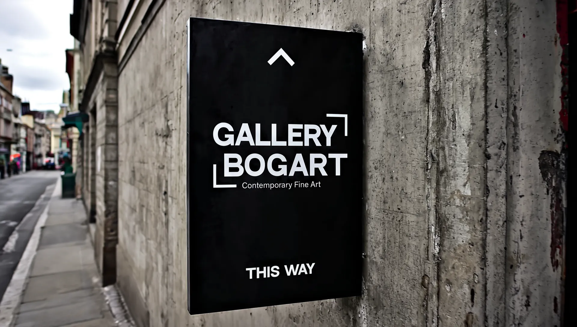
Gallery Bogart operates as a cultural bridge in the West Bottoms art district, presenting a global roster with a clear commitment to Latin American voices. Our partnership spans three years and runs wide: brand identity, exhibition campaigns, catalogues, postcards, wayfinding, signage, motion, and social systems. The design language is surgical. No icons. No flavor-of-the-month motifs. Just text, spacing, and a bracket device that can expand, lock, or whisper depending on the artwork behind it. The gallery’s own stance guided the build: champion contemporary Latin American art, keep the space neutral, and let the work spark the dialogue.

Cultural Context

Major U.S. museum collections skew heavily white and male. A widely cited analysis across 18 museums found artists to be 85.4% white and 87% men, with Hispanic and Latinx artists at roughly 2.8%. Set that against the country’s demographics, where Hispanics account for about 19.5% of the population, and you get the gap that shapes how audiences see culture in the first place. Gallery Bogart positions itself inside that reality and answers with programming that elevates Latin American and global voices from a Midwestern vantage point. The brand had to embody that stance without sliding into token aesthetics.

The Challenge

Build an identity that could hold space for a rotating roster of Latin American and global artists without imposing a house style.

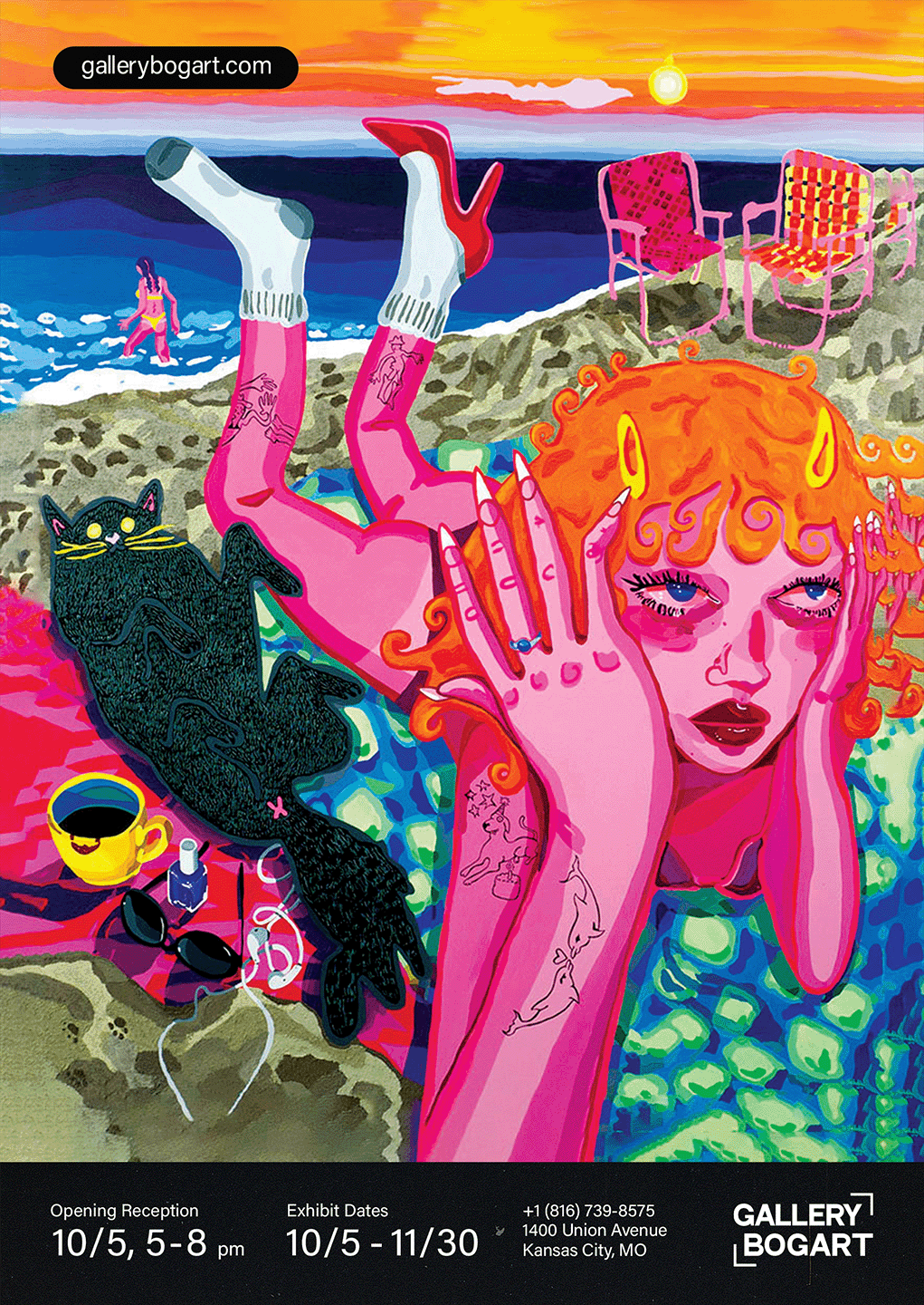
Every poster, catalogue, label, and social tile would sit over unpredictable color, texture, and themes. The system had to read in a sunlit street, at a crowded opening, and on a midnight phone scroll. Recognizable without a mascot. No folk clichés, no “Latin” palette, no icons that flatten culture. The gallery needed a frame that could scale from a city banner to a caption, remain WCAG-conscious for access, and stay credible across years of exhibitions.

Make the brand present yet quiet. Strong enough to organize the room, humble enough to disappear when the art speaks.
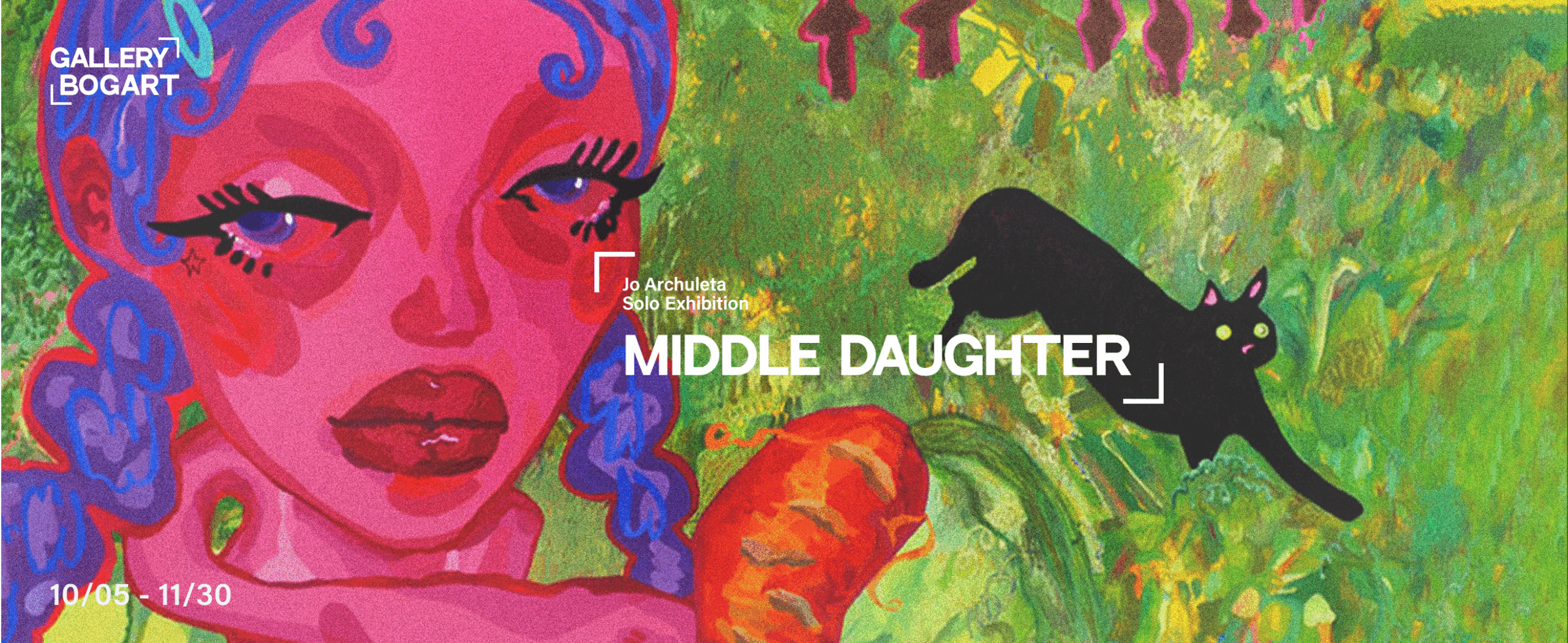
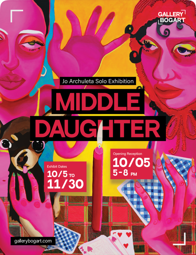
We built the identity as an act of anti-exoticism. Black and white keeps the ground neutral. Typography carries the message. The square bracket is the one gesture, a curatorial instrument that frames without decorating. It compresses to anchor type over dense imagery, opens up for wide compositions, and becomes wayfinding when scaled to architecture. The bracket behaves like a museum label and a crop mark at once, a cue for attention rather than a costume for culture. This is a frame that refuses to stereotype.

Impact

  • 100+ event and brand partnerships
  • 25 000+ in‑person attendees across eight sessions
  • 175% organic increase in brand reach
  • PKR 5 million+ worth of tickets sold
  • 70% rise in online ticket sales
  • *Metrics supplied by the client’s POS and social dashboards.

Execution stayed disciplined across formats. Posters and teasers read like editorial spreads: headline, lede, evidence. Catalogues carry data callouts and clean grids. Wayfinding uses scale and spacing so visitors can scan quickly in a crowd. On social, the bracket locks type against moving imagery, which keeps recognition high without color-coding the identity. Across shows that ranged from political figuration to hyper-chromatic surrealism, the system stayed consistent and respectful. The art leads, the brand orchestrates, the audience gets clarity.

The outcome is a brand that does its politics quietly. In a market that often packages “Latin” with clichés, Gallery Bogart’s identity centers the work rather than the stereotype. The frame signals care. The contrast signals access. Over time, the repetition of bracket and type becomes a kind of signature you feel more than notice. That is the point. The gallery holds the space and the art gets the room it deserves.

Read Another

How to brand the city’s best kept secret for culture hungry youth?

Explore your creative options with us

We work in fragments. Light, type, motion, silence. We cut, reframe, rebuild. Until something clicks—visually, emotionally, maybe both. We don’t pretend to be everything.

Reach out

or come in for chae

WB, Gulberg, Islamabad