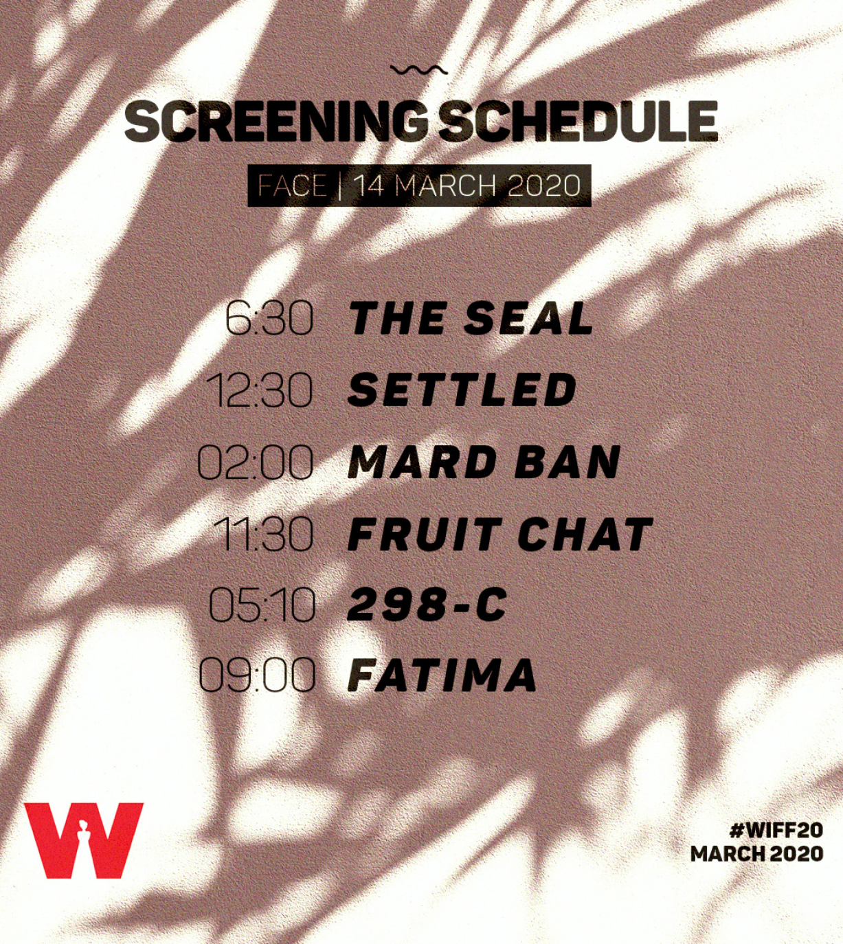
The baseline is unequal. In the top-grossing films of 2022, women made up about 24 percent of key behind-the-scenes roles and only 18 percent of directors. Ninety-three percent of those films had no woman cinematographer. The 2023 update shows slippage in several categories. Festivals at the top end of the circuit have inched forward, but competition lineups still sit around a third women at best. In U.S. media, South Asian women remain sharply under-represented. WIFF lives inside these numbers and argues with programming, not slogans.
The Challenge
Make the brand feel like cinema without leaning on illustration or generic festival tropes. Posters from different countries and aesthetics must sit in one system. Schedules and IDs must read at five meters in low light. Social assets need contrast and hierarchy that punch through algorithm sludge. The identity has to survive bilingual layouts, sponsor density, mixed paper stocks and phone glare. Everything should look handled by light rather than built from clip art.
Design Thesis
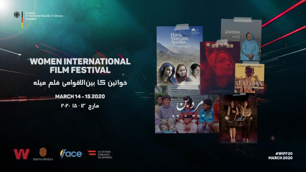
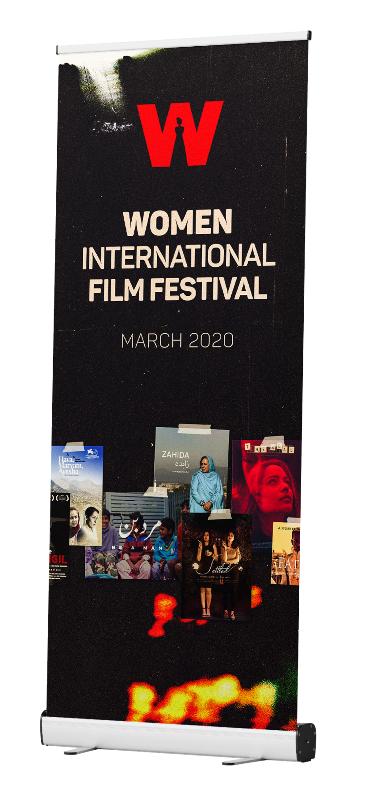
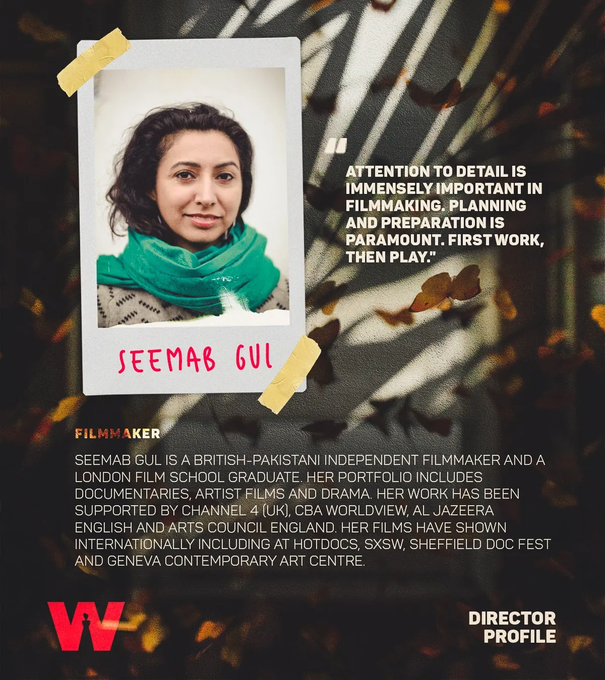
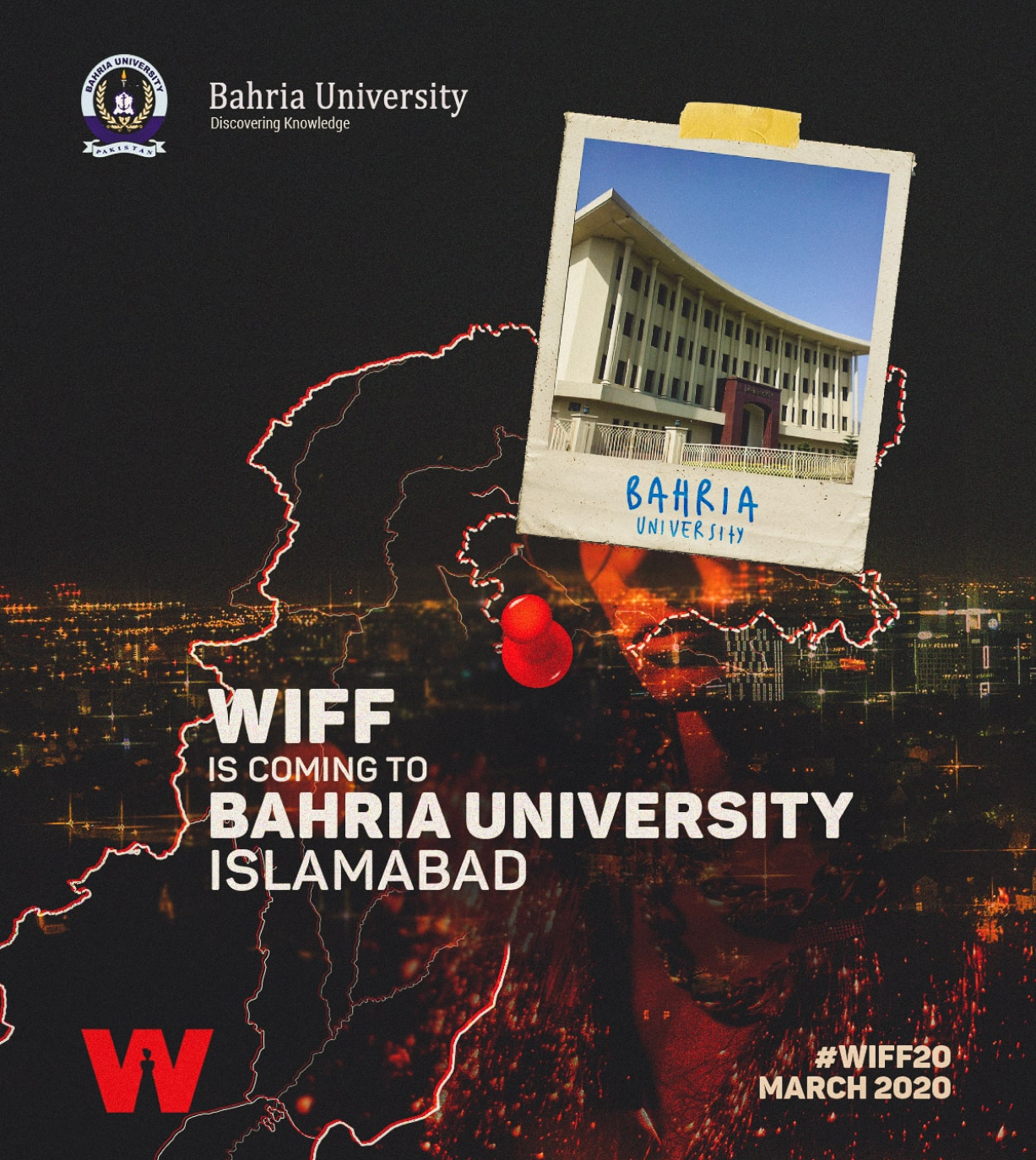
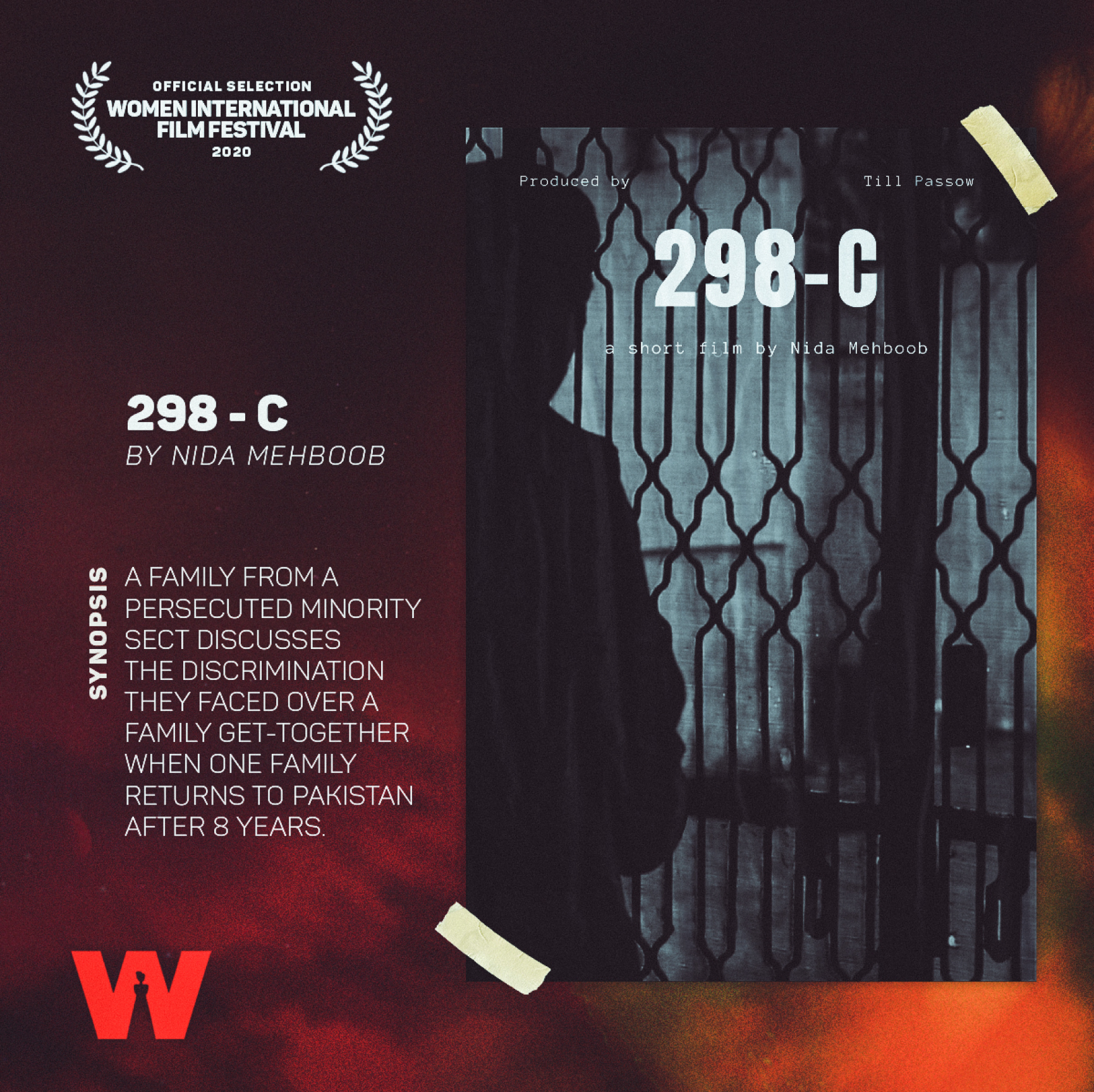
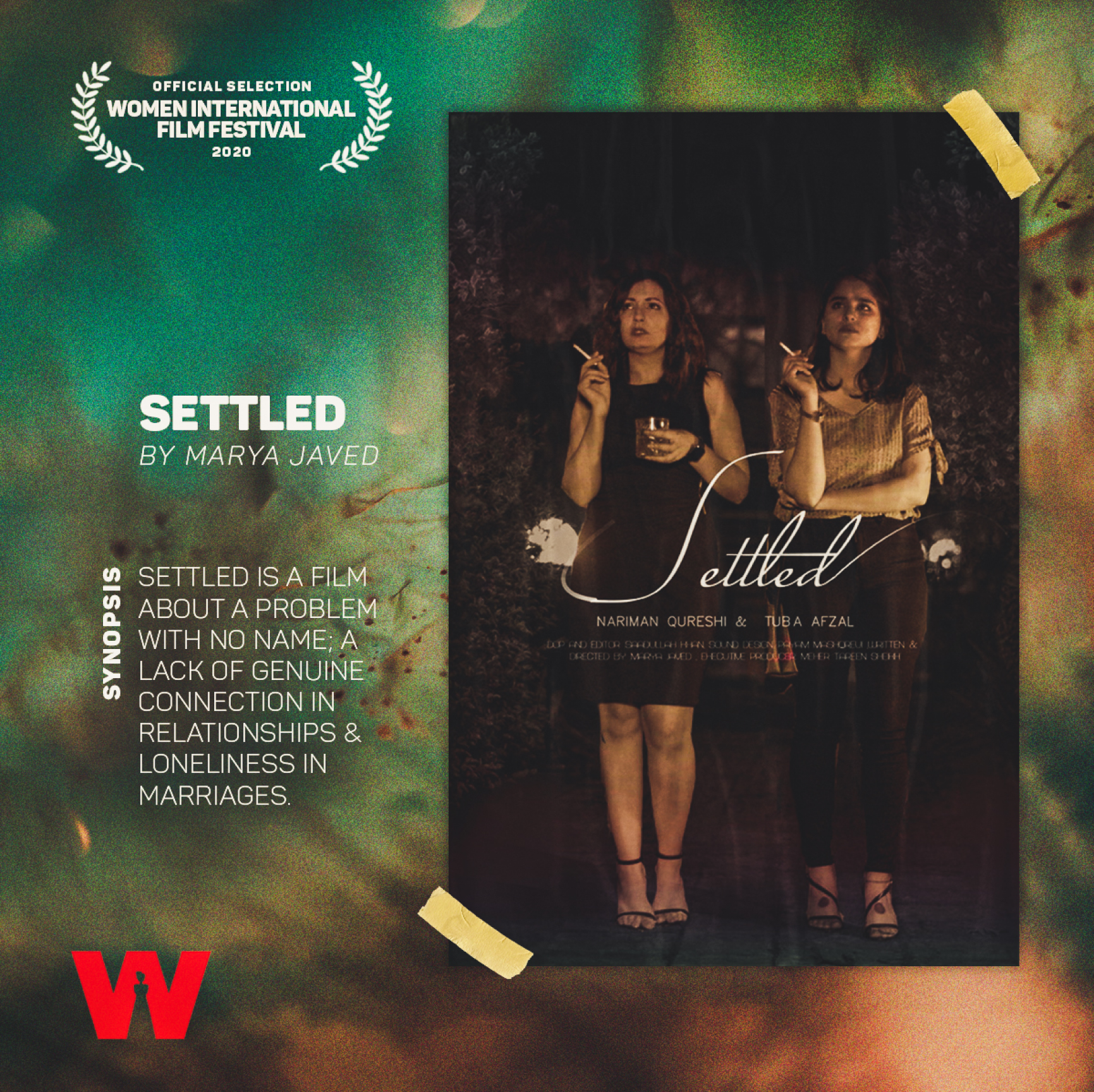
Treat the brand as photographic proof. Use textures that result from light touching material. Grain signals exposure. Light leaks create heat at the frame edge. Burn marks act like scene transitions. Polaroid frames solve a real problem, which is how to feature many external posters without turning the identity into a collage. The frame turns each poster into an artifact with title, director, synopsis, and laurels set in a consistent hierarchy.
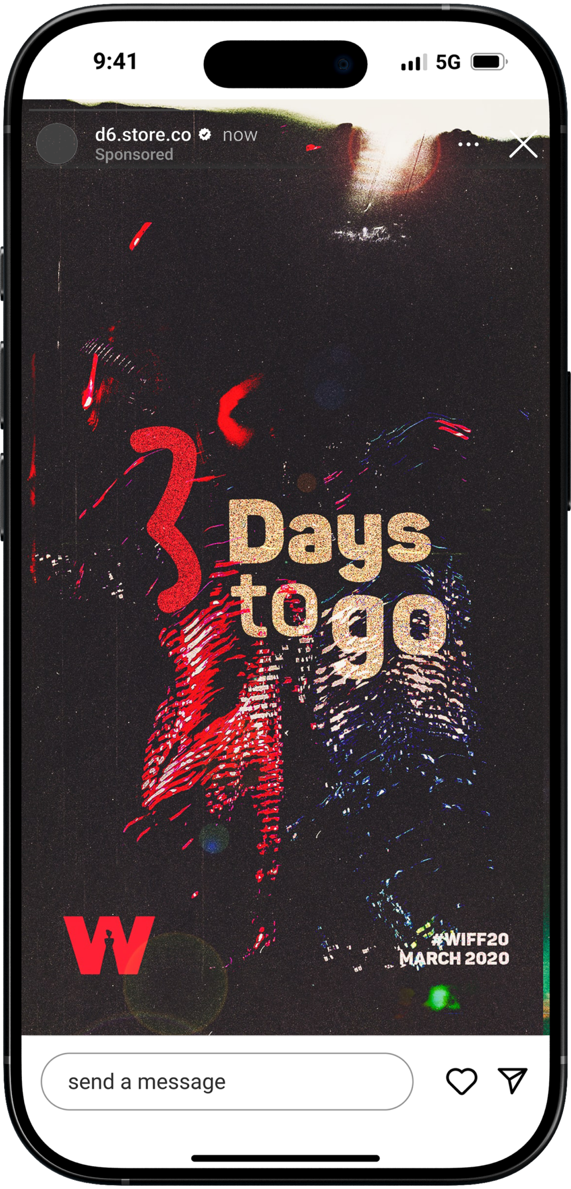
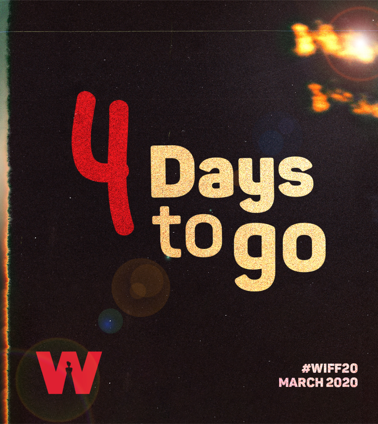
The festival lives in dim rooms and on bright screens. We designed for both. Large numerals drive countdowns. Title cards carry strong counters and open spacing. The red W serves as a beacon that anchors every surface without competing with the film art.
Method & Evidence
Field tests came first. We printed key assets and checked legibility from five meters in a low-lit hallway. We tested the same assets on glossy stock under hard light. We ran the countdown tiles on older phones with cracked glass. If it did not read cleanly, it did not ship.
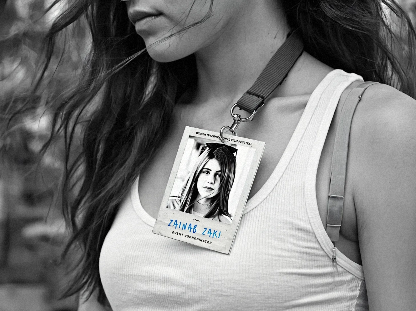
The system is modular. One grid runs across posters, schedules, bilingual announcements, sponsor plates, and ID cards. Social motion follows a trailer logic. Flares sweep across numerals to reveal titles. Burns punctuate transitions. The kit is deliberately small, which keeps the look coherent at speed.
Impact
More than 20 women‑directed films screened each year.
35 000 plus social followers and climbing.
Over 2 500 festival attendees across three editions.
200 000 video views on festival reels and trailers.
The refresh takes a stand without turning the brand into a slogan. Light leaves marks. We kept those marks visible. The festival now looks like a place where work by women is not merely screened. It is held, labeled with care, and remembered.