
Before the beat
Islamabad is tidy and restrained. Streets behave. Buildings mind their edges. After years of headlines filled with blasts, sirens, and security checks, a lot of people learned to live slightly smaller in public. The nervous system does what it must. You scroll. You rush home. You keep the volume down.
DCI appears in that atmosphere with a soft counter-move. A circle in a park. Hands on drumheads. Call and response until the pulse settles. It looks like play and it reads like a secular zikr. Repetition. Breath. A way to stand next to strangers without pretending you are not changed by the last decade.
The brand needed to honor that tone. Not a concert. Not a campaign. A recurring civic moment that anyone can enter. That meant the visuals had to name a place, point at a time, and create a mood where people feel safe enough to be loud together.
The Challenge
Design a brand that invites participation, not audience behavior. It had to read in low light, survive on phone screens, and hold its own against unpredictable backgrounds. The system needed to travel across parks, cafés, rooftops, malls, and corporate pop-ups without turning into event spam. Bilingual, legible, affordable to print, easy to remix by collaborators. And it needed a center of gravity strong enough to carry a bigger idea about post-2010s youth, numbness, and the need for shared rituals that melt the edges of the ego.

The Circle
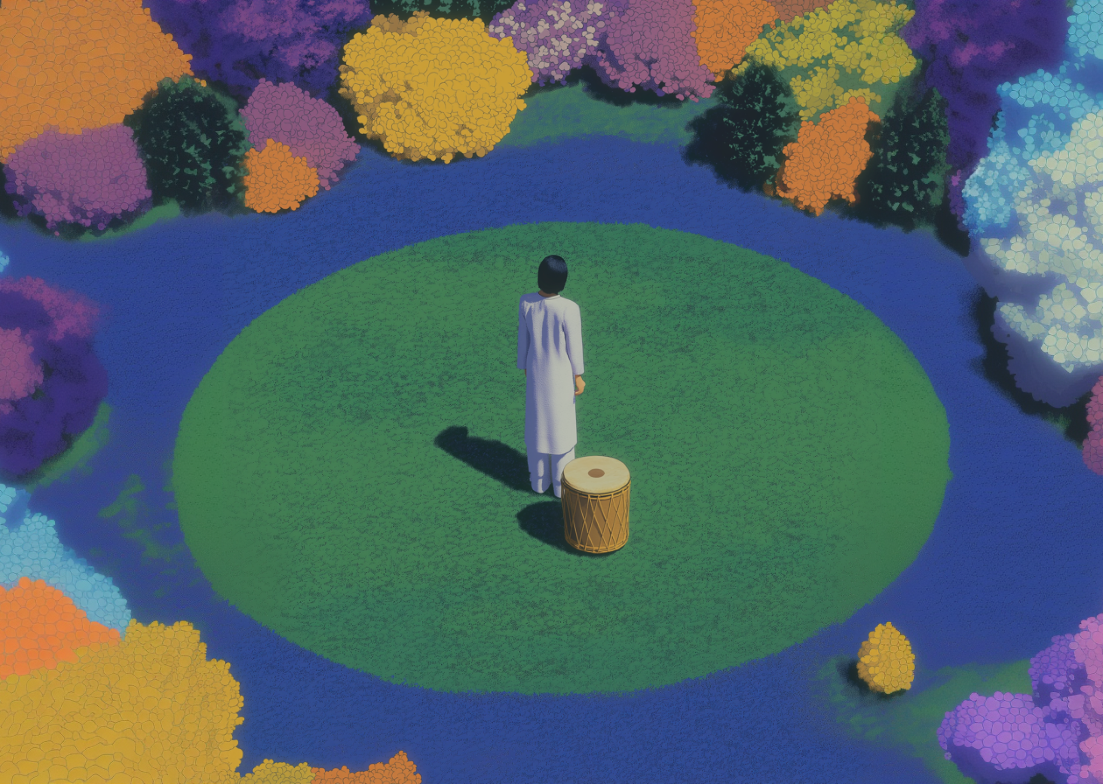
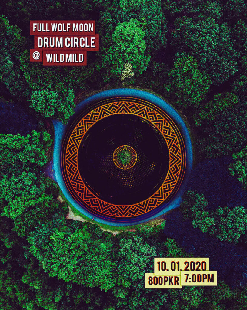
We built the system around a red circle that behaves like a ritual object. It is drum, moon, bonfire, and map pin. Small, it marks the host. Large, it becomes the event. It drops onto real locations so the invitation never floats. You see the façade, the plaza, the trees. You know where your body will be.
Headlines use a tall serif that carries ceremony. Time and coordinates sit in a blunt grotesk that you can read at five meters. Crimson and ember on charcoal keep the heat human. Grain and matte blacks keep everything honest. The city is already glossy enough.
The grammar is simple. Center the ring in open spaces. Slide it off-axis when a landmark needs to anchor the eye. Add a thin halo for quiet gatherings. Turn up the ember for nights that plan for a crowd. Motion follows breath. Radial wipes and slow oscillations behave like lungs between hits. On stories, countdown numerals glow like marquee bulbs without screaming.
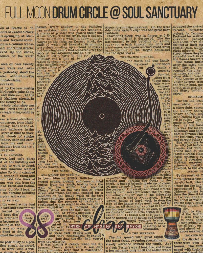
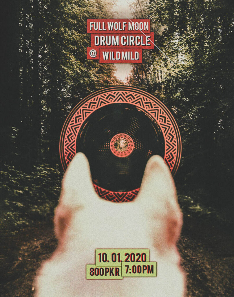
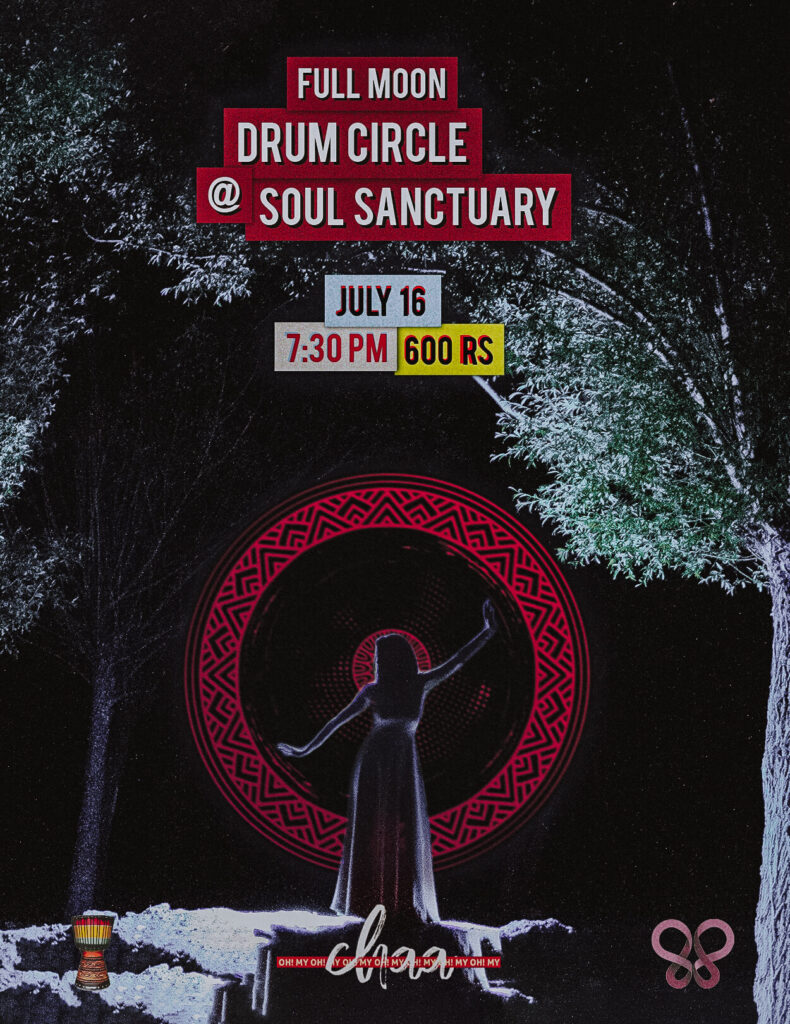
Real constraints shaped the craft. We tested legibility in low light and on cracked screens. We locked bilingual layouts so hierarchy holds when Urdu enters the frame. We printed on cheap stock to make sure reds stayed warm and blacks stayed soft. We built sponsor plates that snap to a base grid so partnerships never drown the invitation. The on-site kit is a banner with the ember ring, a few wayfinding cues, and a single instruction at entry that resets behavior: listen first, then join.
There were misses. Early posters read like gigs and pulled too many spectators. We pushed the typography toward instruction and kept the photography place-first. The tone shifted. People arrived ready to play. The circle held.
As the project moved, the ring learned to travel. Parks, rooftops, courtyards, malls, fundraiser nights, collaboration pop-ups. The identity flexed without losing the ritual core. A monthly full-moon series turned the ring into a calendar that trained anticipation. Aerial shots proved what the night feels like from above. The circle makes the space.

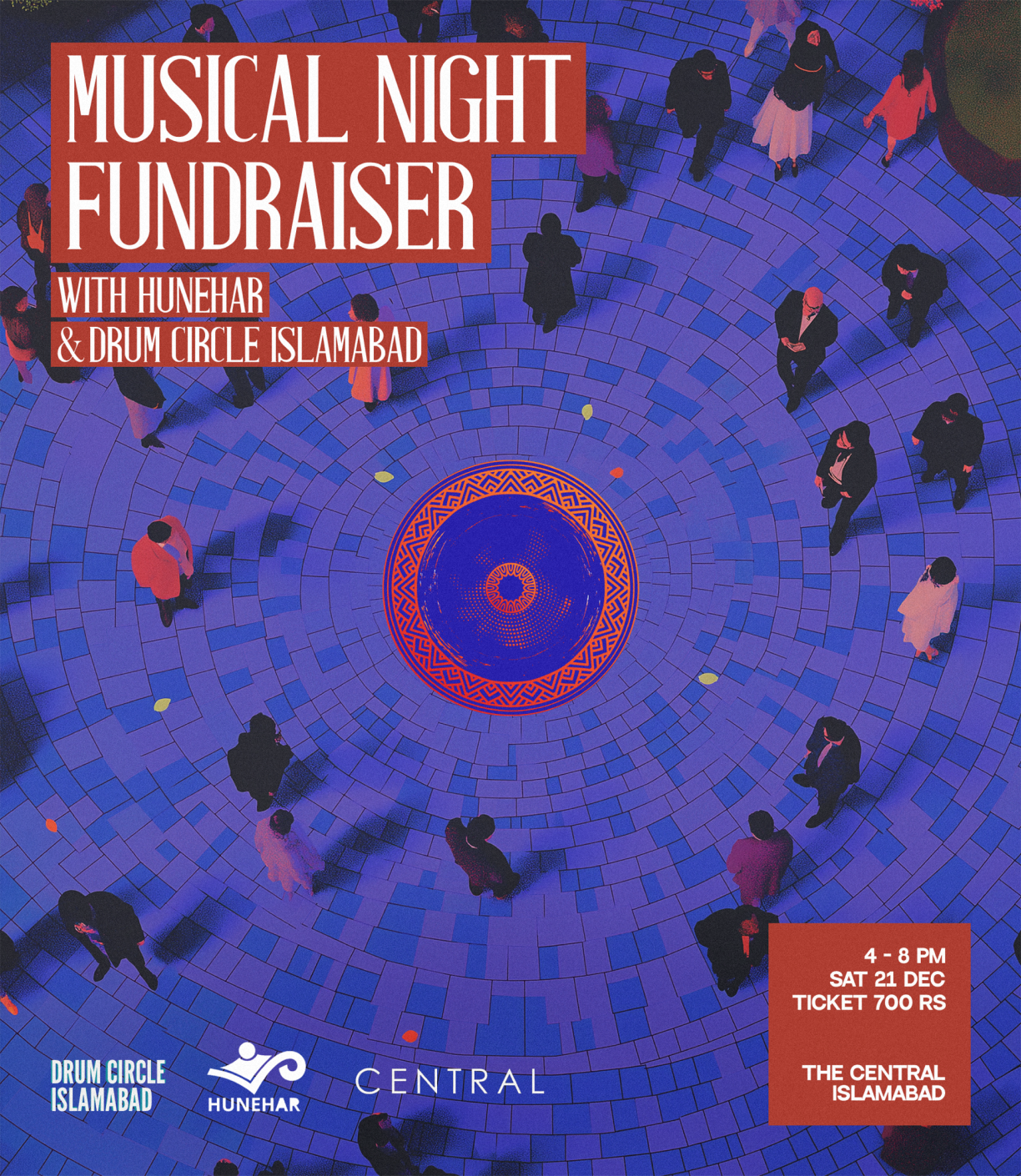
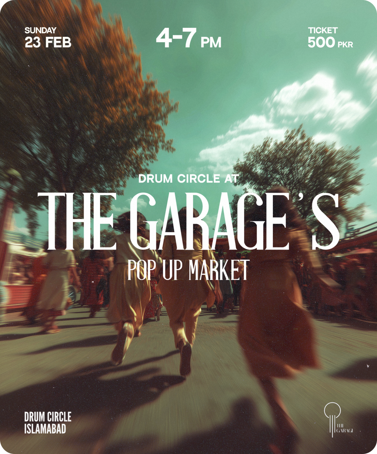
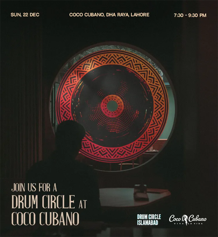
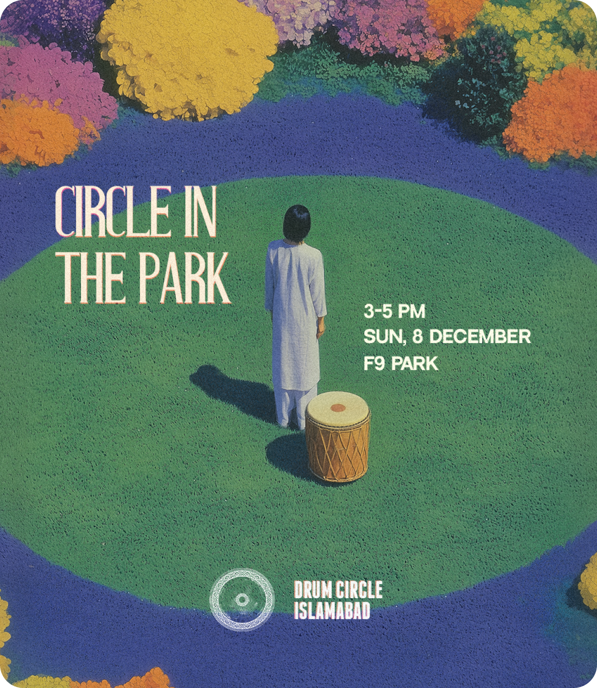
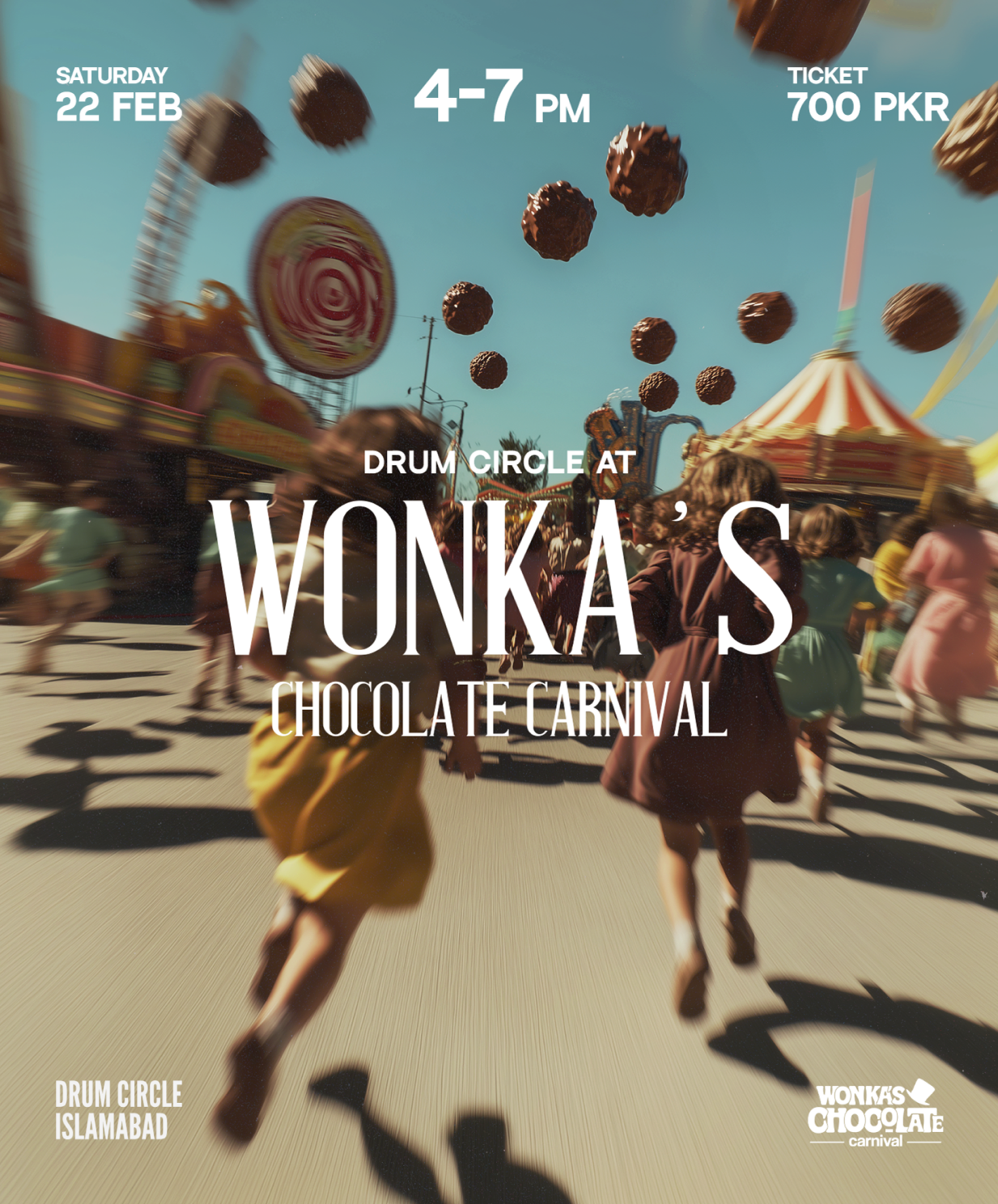
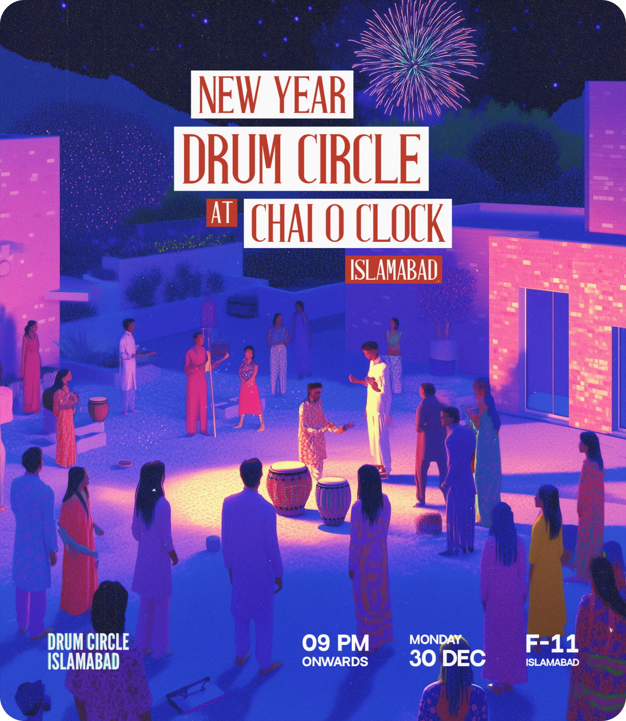

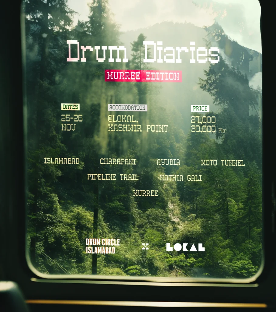
When the numbness runs deep, place matters. The city can feel like a shell. So the circle started to move. Mountains, lakes, old caravan routes, courtyards near shrines, sites where the wind already knows a rhythm. A day on the road resets attention. At dusk, drums gather by water and the red ring warms like a small sun. The ego softens. People cook together, walk together, play until the cold bites, then sleep like they earned it. The next morning feels bigger.
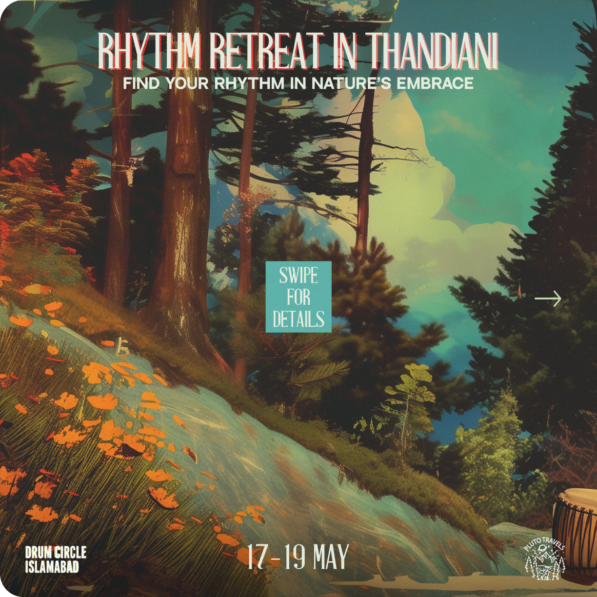
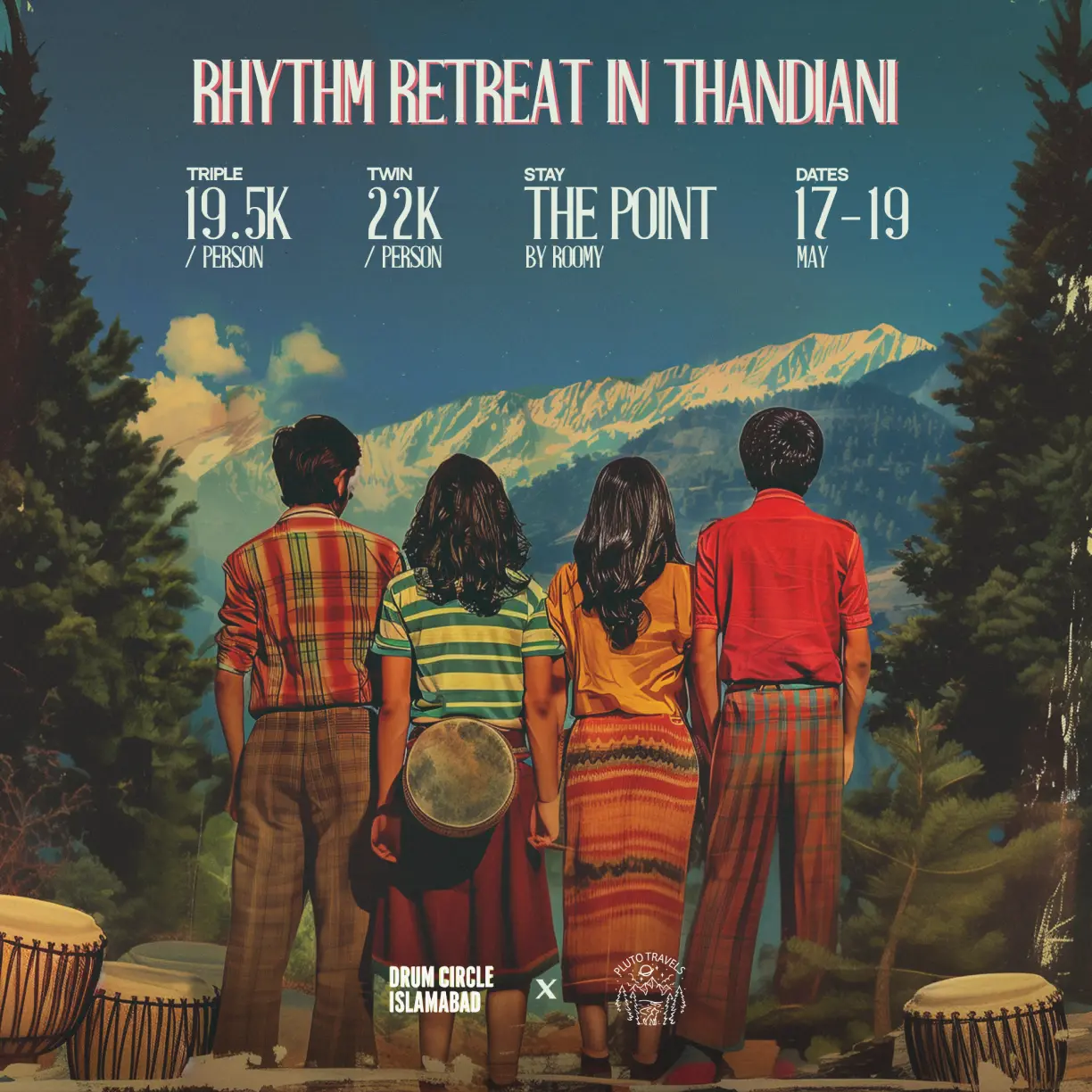
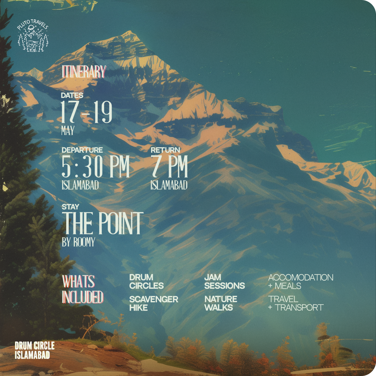
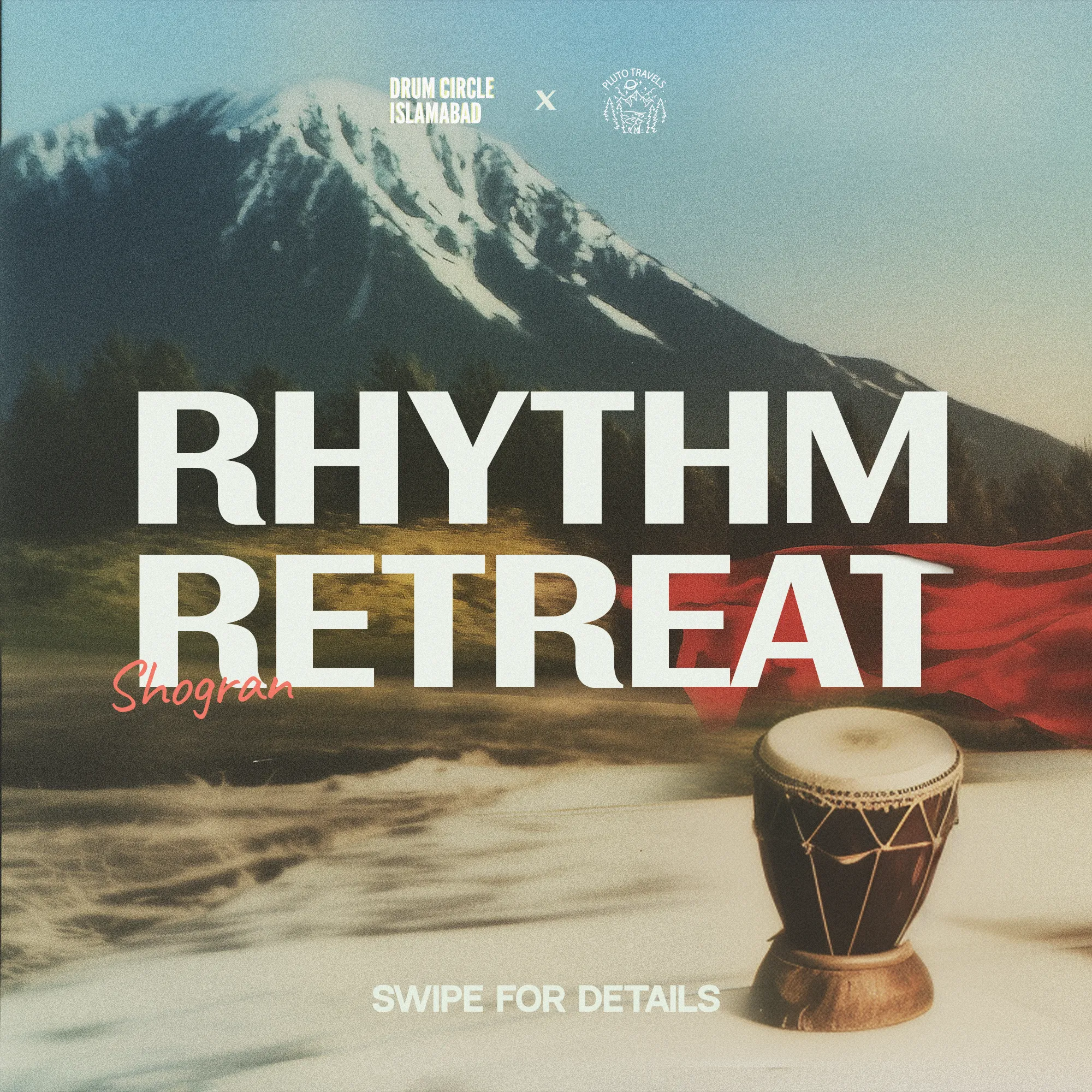
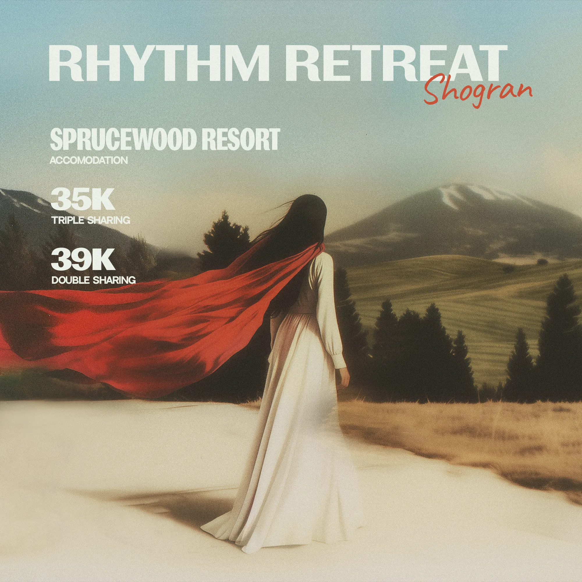
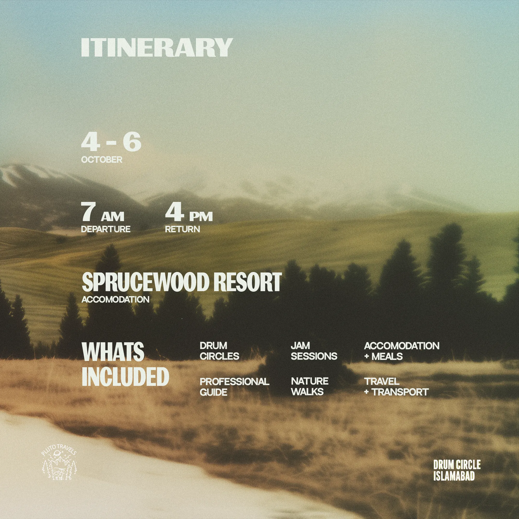
We built the travel side like an extension of the ritual, not a side hustle. The identity stayed strict so the meaning stayed intact.
We produced cinematic ads and short cuts that behave like field notes. Fifteen seconds that start quiet, hold a face, then reveal the circle and the room it makes outdoors. Sound-on lands first, but every edit reads sound-off. Animations use flare, ember, and slow iris pulls so motion still feels human. Nothing bombastic. You are being invited to do something, not watch someone.
Key Takeaways
You feel the change when it breaks up. People linger. Strangers talk like neighbors. The park looks different for a day or two. The mountain air sits in the body for longer. This is small politics. Not a speech. A practice. Rhythm moves attention out of the head and into the room. Travel helps. Music helps faster and cheaper and right where you live.
That is why the system stays strict. The red ring keeps memory across months. The serif gives the night its ceremony. The grotesk gets everyone to the right place on time. The trailers and ads carry the feeling without selling it out. UI and RSVP flows translate a folk ritual into logistics without sanding off the edges. The work favors care over spectacle. It treats the city as a body that can be warmed, and the landscape as a teacher that can be carried home.
What remains is a portable shrine you can lift from park to park, from lake to stone courtyard. A circle that borrows from Sufi repetition without dressing like religion. A quiet answer to a hard decade. And a brand that knows when to step back so the beat can do the talking.